UX/UI Solutions
Wi-Fi Access Interfaces
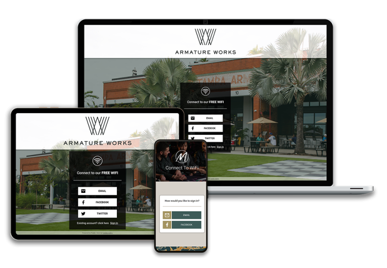
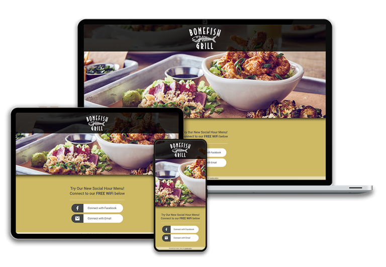
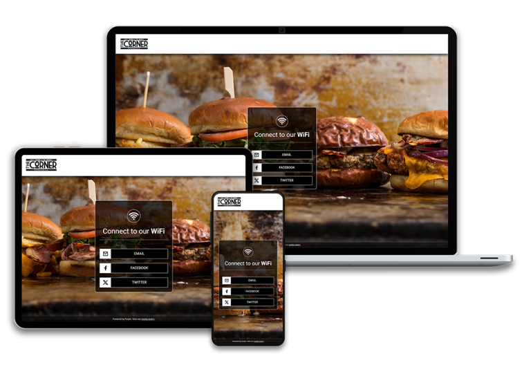
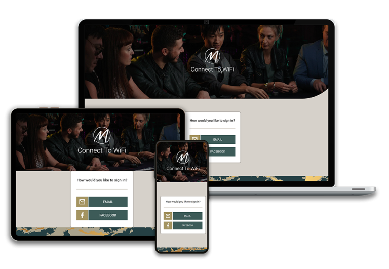
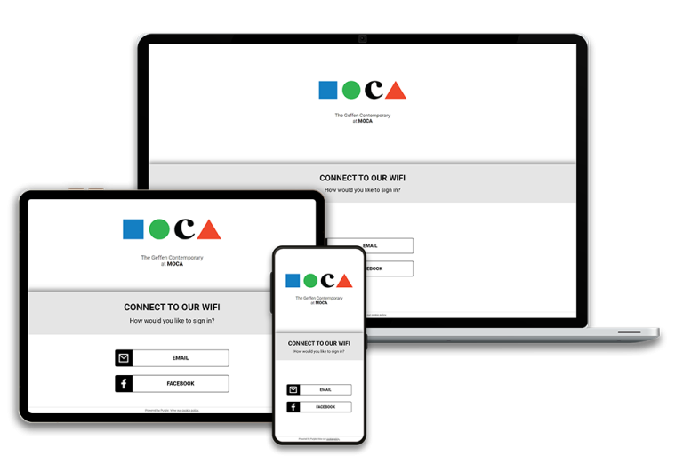
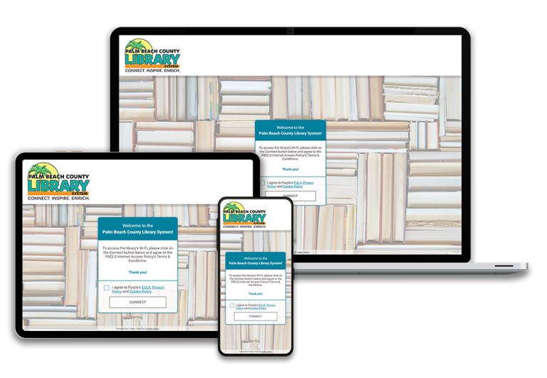
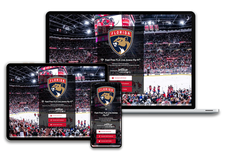
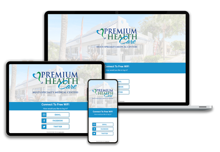
In my role as a designer for WiFi access interfaces, I specialize in creating custom splash pages that facilitate seamless connectivity for visitors accessing public WiFi in various venues. Utilizing Purple’s innovative platform, I build these user-friendly access portals using CSS and HTML, ensuring they align perfectly with each venue’s unique branding. My diverse clientele spans entertainment businesses, stadiums, and restaurants, allowing me to craft engaging landing pages that not only provide easy access to WiFi but also enhance the overall guest experience by reflecting the venue’s identity and aesthetic.
Academic UI/UX Cases
Currently, I am pursuing a UI/UX certification through Cuyahoga Community College, where I engage in projects designed to tackle specific criteria and solve real-world problems. Each project has led to innovative solutions that reflect my growing expertise in user-centered design. Alongside these projects, I’ve compiled design thinking documents that elaborate on the planning and rationale behind my design choices, effectively communicating my thought process and methodologies. Here, I present a selection of these projects, showcasing my commitment to creating impactful and user-friendly designs.

Optimizing User Experience to Address Challenges
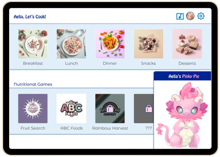
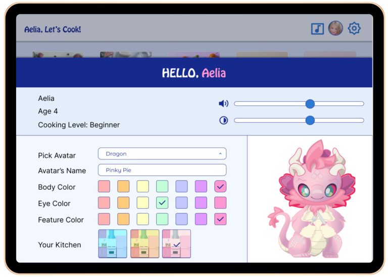
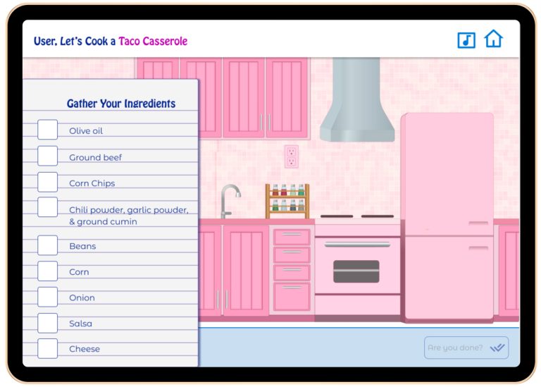
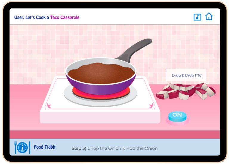
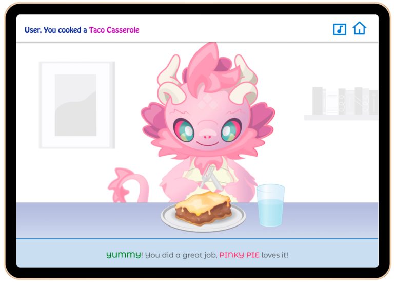
Tiny Chef in Training
Tiny Chef in Training” is an interactive UI/UX project developed using Figma as part of my UI/UX certification training at Tri-C. The project aims to inspire toddlers to explore and embrace healthy foods through engaging and interactive activities. By leveraging immersive mini-games and virtual cooking experiences, the app provides a fun and educational platform where children can learn about healthy eating habits while honing their culinary skills. The design focuses on creating an intuitive user interface that captivates young audiences, encouraging them to experiment and engage in the culinary world.
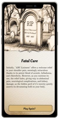
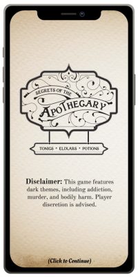
Secrets of the Apothecary
Utilizing Non-Linear StoryTelling to create a Interactive Narrative
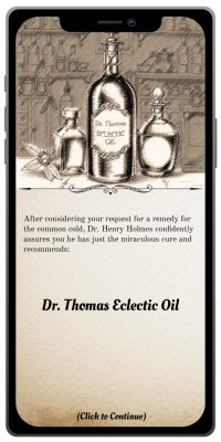
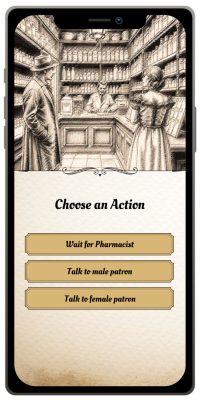
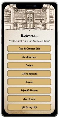
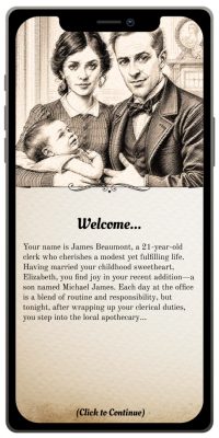
“Secrets of the Apothecary” is a non-linear interactive narrative game crafted in Figma during my UI/UX certification training. Set in a turn-of-the-century apothecary, this project allows users to navigate through various pathways and decisions, uncovering hidden stories and secrets of the time. Players assume the role of the main character, exploring intricate plot lines that reveal the dark realities and medicinal practices of the era. The design emphasizes user engagement through a simple but effective interface that blends historical elements with interactive storytelling.
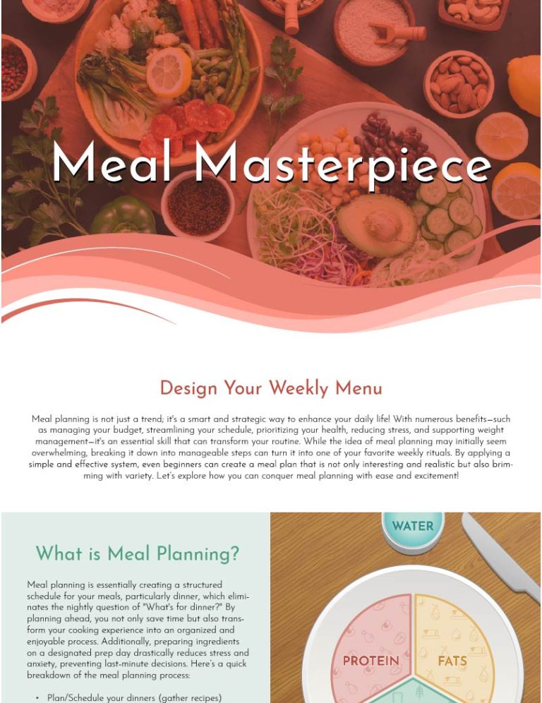
Meal Masterpiece
Employing Linear Narrative to Effectively Educate a Target Audience
This linear infographic, created during my time at Tri-C for my UI/UX certification, serves as a practical communication tool for community programs and health and fitness initiatives. Its primary goal is to illustrate the benefits of meal planning and how it can foster nutritional eating habits for busy individuals. The design presents a clear and visually engaging pathway that highlights essential aspects, such as time-saving techniques, cost-effectiveness, and improved dietary choices, making it easy for users to understand the positive impacts meal planning can have on their lifestyles. By combining informative graphics with succinct text, this infographic aims to motivate busy individuals to adopt healthier eating patterns through effective meal preparation strategies.
UI Design Solutions
In two notable projects, I contributed specifically to the UI design process for updating Purple WiFi’s website and their internal intranet, collaborating within a larger team to enhance the user experience. I am excited to share my Adobe XD files, which showcase the design elements I developed and refined throughout these projects. These files illustrate my individual contributions while also highlighting how they fit into the cohesive design strategy of the overall project. My role allowed me to blend creativity with functionality, ensuring that the interface not only looked appealing but also effectively met user needs.

Purple WiFi's Website
Revitalizing Purple WiFi: A Fresh Take on Brand Aesthetics
In the project to update Purple WiFi’s website, I reimagined their branding by blending their colors with gradients to create dynamic visuals. This approach enhanced the site’s aesthetic and established a more modern look. Many of the design elements I introduced have been integrated into Purple’s past websites.
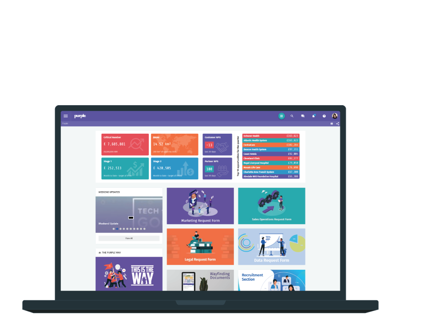
Purple WiFi's Intranet
Creating an Engaging and User-Friendly Intranet
Collaborating with Purple’s web designer, I contributed to the creation of an engaging and user-friendly intranet to house essential documents. Our goal was to craft a fun and intuitive experience, leveraging their bold color scheme while adding our own creative touch to enhance navigation and usability.